
A Steampunk wall gallery fails when every object tries to be important.
A clock. A barometer. A compass. A shelf. A map. A sconce. A brass telescope. A row of old books. Each one may be beautiful alone, but together they can become noise if no object is allowed to command.
That is why the clock matters.
In a serious Steampunk clock shelf display, the clock is not just another object placed near other objects. It is the visual anchor. The shelf, instruments, documents, and lighting all arrange themselves around it.
The Victorians understood this instinctively. On a mantel, the mantel clock stood at the formal center. Candlesticks, vases, framed portraits, and small instruments existed in relation to it. The clock did not merely sit there. It governed the display.
A modern wall gallery with clock Steampunk composition follows the same rule.
First, the clock commands.
Then the shelf serves.
The Clock as Composition Anchor – Not Just Another Object
There are two ways to use a Steampunk clock with shelving.
The first is simple: place the clock on a shelf.
That works, but it is not composition yet. It is storage. The clock becomes one object among many, competing with books, jars, gears, and instruments.
The second way is stronger: make the clock the focal point of the entire shelf composition.
In this arrangement, the clock may be on the wall above the shelf, centered behind it, or placed on the shelf as the tallest object. The shelf becomes the base layer. The surrounding instruments become supporting characters. Small objects create texture. Lighting frames the whole scene.
This is how a shelf stops being a shelf and becomes a wall system.
A proper Steampunk gallery wall should feel like someone intelligent lives there. Not someone who bought “vintage decor” by the box, but someone who reads instruments, keeps time, studies maps, and arranges objects because each one belongs to the same private universe.
The clock is where that universe begins.
For choosing the right anchor clock, see our top steampunk clocks – choosing the right anchor for your composition.
The Three-Tier Composition Model
Tier 1 – The Clock as Visual Anchor
The clock is Tier 1.
It should be the largest, tallest, or most visually commanding object in the composition. If the clock is on the wall, it should sit at the visual center or slightly off-center using the rule of thirds. If it sits on a shelf, it should rise above the surrounding objects.
The face must be readable from the normal viewing distance.
That detail is easy to ignore, but it matters. A clock that cannot be read becomes sculpture. That can be fine if intentional, but if the object is meant to anchor the wall, the dial needs authority.
For a formal composition, place the clock in the center.
For a more collector-driven composition, place it slightly off-center, then balance it with heavier instruments or books on the opposite side.
A large gear clock above a pipe shelf can command the wall alone. A smaller mantel-style clock may need support from a barometer, framed map, or instrument cluster.
The question is simple:
Where does the eye go first?
If the answer is not the clock, the composition has no ruler.
Tier 2 – Supporting Instruments as Context
Tier 2 belongs to supporting instruments.
These objects explain what kind of room this is. A clock tells time, but instruments tell purpose.
Good Tier 2 objects include:
barometer, thermometer, hygrometer, brass compass, sextant, magnifying glass, telescope, pressure gauge, slide rule, or small globe.
These should sit slightly lower than the clock or flank it visually. They should not fight for dominance. Their job is context, not conquest.
A barometer beside a clock says: this room measures time and weather.
A sextant says: this room belongs to navigation.
A magnifying glass says: this room studies small things carefully.
A telescope says: this room looks outward.
This is how theme forms without needing explanation.
For arranging weather instruments together, see our complete instrument triptych guide – barometer, thermometer, hygrometer display.
Tier 3 – Texture Objects as Detail
Tier 3 is where the wall becomes personal.
These are the smaller objects that reward close inspection: specimen jars, small gear arrangements, rolled maps, coin collections, medals, pen holders, amber bottles, wax seals, keys, watch chains, folded notes, and small mechanical fragments.
They should sit between and below the Tier 2 objects.
Their job is not to dominate. Their job is to soften the transitions. They fill negative space, create small discoveries, and prevent the composition from feeling too formal.
A clock and two instruments can look stiff.
A clock, two instruments, three jars, a folded map, and a small brass key can feel lived in.
But restraint matters.
Too many Tier 3 objects turn the shelf into clutter. Use them like punctuation, not wallpaper.

Scale Relationships – Making the Composition Readable
The 3:2:1 Scale Ratio
A strong Steampunk shelf display needs scale hierarchy.
Use the 3:2:1 ratio.
The clock is 3.
The supporting instruments are 2.
The texture objects are 1.
For example, if your wall clock is around 12 inches, your supporting instruments should feel around 8 inches in visual scale, and your small objects should stay around 4 inches or smaller.
This does not need to be mathematically perfect. It needs to feel clear.
The viewer should understand the hierarchy instantly:
First: clock.
Second: instruments.
Third: details.
If every object is similar in size, the eye has no path. It jumps from thing to thing without rest.
If the clock is too small, the instruments overpower it.
If the instruments are too small, the clock looks lonely.
If the texture objects are too large, the display becomes chaotic.
The 3:2:1 scale ratio keeps the wall readable.
Depth Layering
A shelf composition should not be flat.
Use depth.
The front row is for small objects: vials, keys, medals, small gears, folded notes, or low book stacks. Angle them slightly toward the viewer.
The middle row is for instruments: compass, magnifying glass, small barometer, globe, or telescope. These should sit slightly behind the front objects.
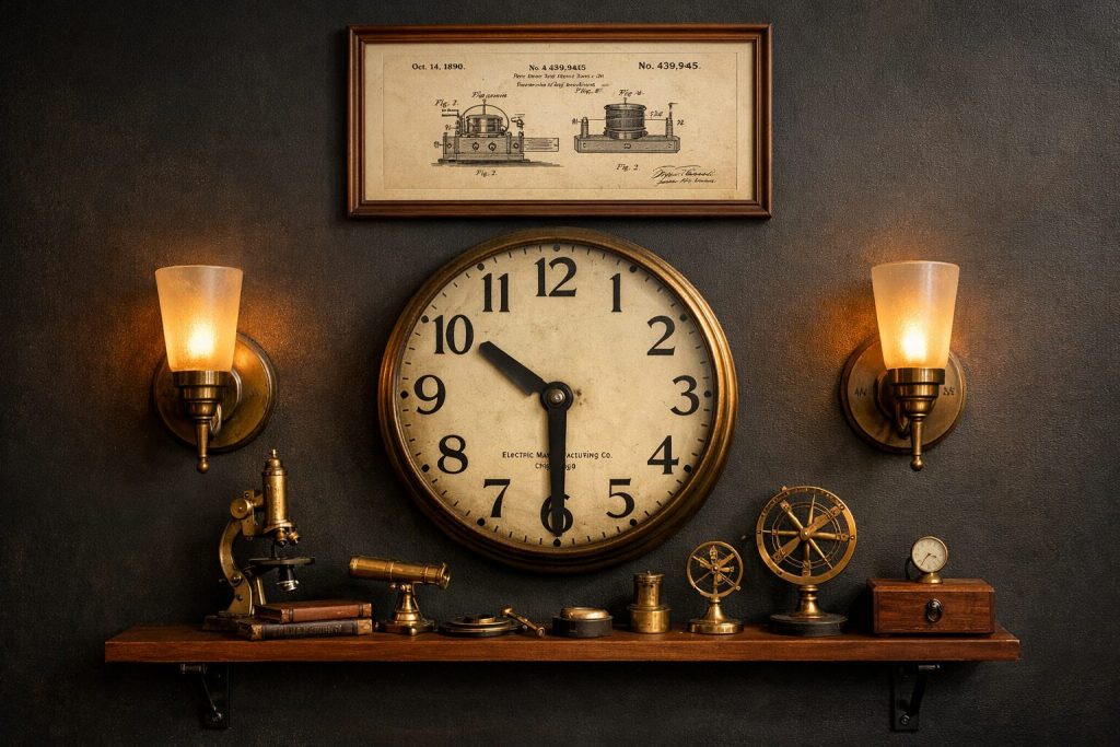
The back row belongs to the clock or vertical backdrop: wall clock, framed patent drawing, map, or standing clock case.
A shelf depth of 9–12 inches is ideal because it gives enough room for three layers. Shallow shelves force everything into one line. Deep shelves allow objects to breathe.
That is why shelf choice matters. The shelf is not just support. It is the stage.
For shelf systems that work as instrument platforms, see our steampunk pipe shelving guide – the platform for your instrument display.
The Gallery Wall Extension – Beyond the Shelf
Clock + Sconce Pairing
A clock becomes stronger when framed by light.
One of the most effective Steampunk wall gallery arrangements is a central clock with wall sconces on both sides. The sconces should sit at equal height and usually around 12–18 inches from the clock edge, depending on wall width and fixture projection.
The sconces do two things.
First, they provide warm light that makes the clock’s surface readable: brass glows, gears cast shadows, dark wood deepens, and glass catches small highlights.
Second, they frame the clock architecturally. The clock no longer feels like an object floating on the wall. It becomes part of a designed composition.
Use warm bulbs only. Amber light, 2200K–2700K, works best. Cool white light will flatten the whole arrangement and make brass look cheap.
A clock with sconces becomes a kind of altar to measurement.
Not religious.
But deliberate.
For the full lighting approach, see our steampunk wall sconce guide – pairing sconces with a clock display.
Art and Documentation Above
The space above the clock should usually stay empty.
But if the composition is tall enough, one piece of documentation can work above it: a navigation chart, patent illustration, mechanical drawing, astronomical map, or aged technical diagram.
This is not “art” in the modern decorative sense.
It should look like evidence.
The frame should match the material language: dark wood, aged brass, black iron, or simple walnut. Avoid glossy modern frames.
A patent drawing above a gear clock works because both speak mechanism.
A maritime chart above a chronometer-style display works because both speak navigation.
A botanical plate above a barometer and hygrometer can work if the theme is natural science.
The key is not filling space.
The key is completing the sentence.
Composition Templates That Work
Template 1 – Formal Victorian Mantel Logic
Place the clock at the exact center.
Flank it with two similar instruments or candlestick-style lamps.
Use small objects in pairs or mirrored clusters.
Best for: fireplace mantel, console table, formal study, symmetrical wall.
This style feels disciplined. It says the owner values order.
Template 2 – Collector’s Workshop Asymmetry
Place the clock slightly left or right of center.
Balance it with a taller instrument or stacked books on the opposite side.
Use small objects to create movement across the shelf.
Best for: study shelves, pipe bracket shelving, desk wall, reading nook.
This style feels more alive. It says the owner is still using the room.
Template 3 – Navigation Wall
Use a clock or chronometer-style object as the anchor.
Add compass, sextant, rolled map, telescope, and nautical chart.
Use brass and dark wood consistently.
Best for: maritime Steampunk, Verne-inspired rooms, collector shelves.
This style feels like departure.
Template 4 – Scientific Instrument Wall
Use a clock with a barometer, thermometer, and hygrometer.
Add specimen jars, magnifying glass, small globe, and notebook.
Best for: laboratory aesthetic, Victorian study, cabinet-of-curiosities wall.
This style feels like observation.
Common Mistakes to Avoid
The first mistake is placing the clock too low on the shelf.
If the clock is buried among objects, it loses authority. Raise it with a book stack, wall mount it above the shelf, or place it behind smaller objects.
The second mistake is using too many small objects.
Small details are useful only when the larger structure is clear. If the eye cannot find the anchor, remove half the small pieces.
The third mistake is mixing too many finishes.
A clock in brass, instruments in chrome, shelf brackets in black iron, frames in bright gold, and bottles in blue glass can feel accidental. Choose one dominant metal and one accent metal.
The fourth mistake is ignoring light.
A clock and shelf composition without lighting often looks flat. Add sconces, a desk lamp, or warm directional light.
The fifth mistake is making the display too symmetrical when it should feel collected.
Symmetry is powerful, but only if intentional. If the wall is meant to feel like a working collector’s space, a little asymmetry gives it breath.
Final Formula: Clock, Instruments, Shelf, Light
Build the wall in this order:
First, choose the clock.
Second, decide whether it sits on the shelf or mounts above it.
Third, choose two or three supporting instruments.
Fourth, select the shelf or surface below.
Fifth, add texture objects sparingly.
Sixth, light the composition.
Then step back.
From a distance, the clock should dominate.
From mid-range, the instruments should explain the theme.
Up close, the small objects should reward attention.
That is the rhythm.
Anchor. Context. Detail.
A Steampunk clock shelf display is not about showing everything you own. It is about making the wall feel as if every object has been waiting for the others.
For building the full room around this kind of composition, see the complete steampunk collector’s workshop – all elements together.


