
A Steampunk wall clock can become the room’s anchor.
Or it can become the object everyone quietly knows is in the wrong place.
The difference is not the clock itself. It is placement.
A large gear clock, a brass regulator, a Nixie-inspired wall piece, or a sculptural timepiece can all look magnificent in a Steampunk collector’s workshop. But if the clock is hung too high, too low, too small for the wall, too close to furniture, or stranded on a pale empty background, the entire object loses authority.
A statement clock should not look like it was added after the room was finished.
It should look like the wall was waiting for it.
That means the placement decision happens before purchase. Measure the wall. Understand the furniture below it. Decide whether the clock will stand alone, sit above a console, flank a fireplace, or become part of a larger display with sconces, shelves, books, and instruments.
For clock sizes and placement requirements across specific models, see our top steampunk clocks – sizes and placement requirements for each.
The Clock as Room Anchor – Why Placement Determines Everything
A statement wall clock has more visual weight than ordinary wall decor.
It is circular, readable, functional, symbolic, and often mechanical. In a Steampunk room, it may also include moving gears, aged metal finishes, Roman numerals, exposed mechanisms, or oversized industrial framing.
That kind of object does not simply fill blank space.
It organizes space.
When placed correctly, the clock becomes the center of gravity. Furniture begins to relate to it. Sconces frame it. Shelves answer it. Objects below it feel curated rather than random.
When placed poorly, the same clock feels detached.
Too high, and it floats.
Too low, and it crowds the furniture.
Too small, and the wall swallows it.
Too large, and the room feels pressured.
Too bright a background, and the mechanism loses drama.
A Steampunk clock placement guide is really a guide to visual authority.
The question is not only “Where can I hang this?”
The question is: “Where will the room believe it belongs?”
Height Rules
The Standard Rule – Center at 57″–60″
The classic art-hanging rule places the center of the piece around 57″–60″ from the floor.
This works because it aligns with average eye level. Museums and galleries use a similar logic: the viewer should not need to crane the neck or look down awkwardly. The object should meet the body naturally.
For a normal wall clock, this rule is a strong starting point.
For a large Steampunk statement clock, especially anything around 24 inches or larger, you can raise the center slightly – about 60″–66″ from the floor. Large clocks carry more vertical mass, and a slightly higher center prevents them from feeling too low or heavy.
But do not overcorrect.
A clock mounted too high stops belonging to the room. It becomes signage.
The best test is simple: stand in the main viewing position. Can you read the time without tilting your head? Does the clock feel connected to the furniture and wall around it? If yes, the height is probably close.
Above Furniture – The Proportional Rule
When hanging a large wall clock above furniture, the clock must relate to the object below it.
A clock above a fireplace mantel should usually sit with the bottom edge about 6″–8″ above the mantle surface.
A clock above a sofa should leave about 6″–10″ between the sofa back and the bottom of the clock.
A clock above a console table can sit slightly higher, with about 8″–12″ between the table surface and the clock bottom.
These numbers are not sacred.
But the relationship is.
If the gap is too large, the clock floats. If the gap is too tight, the clock crowds the furniture. The correct spacing makes the clock and furniture read as one composition.
A Steampunk wall clock often has strong personality. It needs furniture below it that can hold the conversation: dark wood console, leather sofa, fireplace mantel, pipe shelf, or cabinet of curiosities.
A clock over nothing must be strong enough to stand alone.
A clock over furniture must know how to sit in command.

Wall Color and Background
What Colors Make Steampunk Clocks Read Best
A Steampunk clock needs contrast.
Dark walls usually make the mechanism read best. Charcoal, navy, forest green, deep burgundy, and dark brown all create a strong backdrop for aged finishes, brass details, black iron, and moving gears.
Against a dark wall, the clock gains drama. The shadows deepen. The hands become clearer. Metallic surfaces look warmer. Gear forms become more sculptural.
Exposed brick is another excellent background. It naturally supports the industrial language of pipe, gear, brass, and iron. A clock on brick feels less like a decorative object and more like a recovered instrument from an old workshop.
White or cream walls can work, but they reduce the drama. The clock may look more like a novelty item than an integrated statement piece. If you must use a light wall, consider adding a dark wood back panel, a framed section of textured wallpaper, or a small accent zone behind the clock.
A good background should make the clock feel older, heavier, and more intentional.
Not louder.
Deeper.
The Accent Wall Strategy
A full dark room is not always necessary.
One dark accent wall can do the work.
Paint or treat a single wall behind the clock, then keep the rest of the room neutral. This creates an immediate focal point without overwhelming the entire space.
For renters, removable peel-and-stick textured wallpaper can create a similar effect. Brick texture, aged plaster, dark wood grain, or charcoal linen textures can all work if chosen carefully.
The goal is not fake drama.
The goal is contrast with purpose.
A Steampunk wall clock on an accent wall feels like a centerpiece. The same clock on a random pale wall may feel like merchandise.
Scale and Sightline
The 1/3 Rule for Clock-to-Wall Ratio
Scale is the invisible reason a room feels right or wrong.
A helpful rule: the clock width should be roughly one-third of the wall width it occupies.
For example, if the wall section is 90 inches wide, a clock around 30 inches can feel properly scaled. If the clock is only 12 inches wide, it may look lost. If it is 48 inches wide, it may overpower the wall unless the room is large and the design intentionally dramatic.
This rule is especially useful for large Steampunk clocks, because industrial objects tend to have more visual weight than simple modern decor. A 24-inch gear clock can feel larger than a plain 24-inch minimalist clock because of its texture, contrast, moving parts, and shadow detail.
A clock that is slightly too large can still work in Steampunk if the wall and room have enough strength.
A clock that is too small almost always fails.
Industrial design rewards confidence.
Companion Objects – Creating Context
A statement clock should have breathing room above it.
Do not crowd the space above the clock with small frames, signs, or random objects. Negative space gives the clock authority.
Below the clock, context helps.
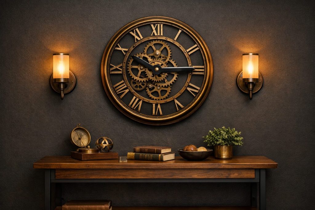
A console table, mantel, shelf, or cabinet can ground the clock. On that surface, use objects that speak the same language: brass compass, stacked books, amber glass, old maps, a small barometer, a magnifying glass, or a specimen jar.
For shelf display objects that pair well with a wall clock, see 30 steampunk objects for shelf display – items that pair with a wall clock.
Flanking the clock with wall sconces can also work beautifully. Place sconces at equal height on both sides, with enough space that the clock does not feel squeezed. Warm amber bulbs are essential. Cool white light will flatten the clock and break the atmosphere.
For lighting pairings, see our steampunk wall sconce guide – pairing sconces with a statement clock.
Hanging Hardware for Heavy Clocks
Weight Assessment Before Hanging
Before hanging any large wall clock, check the weight.
Do not guess.
A lightweight clock under 5 lbs may work with a standard drywall picture hook, assuming the wall is in good condition.
A clock between 5–15 lbs should use stronger hardware, ideally a French cleat, keyhole plate, or screw into a stud.
Anything over 15 lbs should be treated as a serious wall-mounted object. Use a stud whenever possible. For wide clocks, use two hanging points to distribute weight and prevent rotation.
Even if a clock feels manageable in your hands, remember: wall stress is continuous. A clock hangs every hour of every day. A poor anchor does not fail immediately. It fails later, when everyone has stopped thinking about it.
That is why proper mounting matters.
For installation and setup details, see installing and setting up your steampunk clock – complete guide.
Level Check Protocol
A crooked clock is worse than a crooked frame.
People notice because clocks already imply precision. If the clock is off-level, the room feels wrong even before the viewer knows why.
Use a spirit level before final hanging. If the clock has a flat top, place the level there. If the clock is round or irregular, mark the centerline on the wall and use the hanging hardware as your guide.
For asymmetric pieces, a normal level may not be enough. Use a plumb line or pendulum reference from the center point to ensure the clock hangs visually balanced.
Then take a photo.
This sounds unnecessary, but the camera often catches level errors the eye accepts in person. Look at the photo on your phone. If the clock feels tilted in the image, adjust it.
A Steampunk clock may be romantic, aged, oxidized, and imperfect.
But it should not hang carelessly.
Common Placement Mistakes
The most common mistake is hanging the clock too high.
People often treat large clocks like signs and push them upward. This makes the room feel disconnected. The clock should belong to the furniture and people in the room, not hover above them.
The second mistake is choosing a clock too small for the wall.
A 12-inch clock on a wide feature wall rarely becomes a statement. It becomes a dot.
The third mistake is placing the clock on the wrong background.
A detailed gear clock on a busy patterned wall can disappear. A bronze clock on a beige wall can look flat. A dark clock on dark wood without lighting can become invisible.
The fourth mistake is ignoring light.
A statement clock needs controlled illumination. Sconces, picture lights, desk lamps, or warm ambient light can all help. Without light, texture disappears.
The fifth mistake is crowding the clock.
A strong clock does not need a dozen small frames fighting for attention. Give it air. Let the room recognize its role.
Final Placement Formula
For most Steampunk wall clock installations, use this formula:
Choose a wall with enough width for the clock to occupy roughly one-third of the visual field.
Place the center around 57″–60″ for normal clocks, or 60″–66″ for large statement clocks.
If hanging above furniture, keep the bottom edge about 6″–12″ above the furniture surface, depending on the piece.
Use a dark or textured background when possible.
Ground the clock with a console, mantel, shelf, or object cluster below.
Add warm lighting from the side, not harsh overhead light.
Use proper hardware based on weight.
Level it carefully.
Then stop adding things.
A statement clock needs company, not competition.
Closing Thought
A Steampunk wall clock is one of the easiest objects to buy and one of the easiest objects to place badly.
That is why placement matters so much.
The right clock in the wrong place becomes decoration.
The right clock in the right place becomes architecture.
It can anchor the wall, organize the furniture, invite the sconces, command the shelf below, and give the room a center of gravity. More than that, it can make the room feel like time itself has been built into the design.
Not displayed.
Built.
For the broader room system, see placing your clock in a complete steampunk room design.


