
There is a moment in almost every Steampunk room build when the mistake quietly happens.
Someone chooses the sconce first.
The pipe shape looks right. The cage feels industrial enough. The arm projection fits the wall. The proportions work beside the bookshelf or above the desk.
Then, almost as an afterthought, they choose the finish.
Black. Brass. Bronze. Whatever looks “close enough.”
And that is usually the exact moment the room begins to lose coherence.
Because in Steampunk interiors, the finish is not decoration layered on top of the object. The finish is the emotional language of the object. It determines whether the wall sconce feels like it came from a Victorian railway office, a ship captain’s cabin, an abandoned factory corridor, or a modern apartment pretending to be one of those things.
The wall plate finish is the sconce’s relationship to its room.
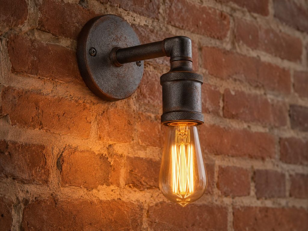
An aged brass wall bracket against deep green paint speaks softly, like old paper and tobacco smoke. Oil-rubbed bronze against plaster feels utilitarian and grounded. Raw iron on exposed brick feels unfinished in the most honest possible way – steel left exposed to time because function mattered more than polish.
The shape may determine the silhouette.
The finish determines the story.

Aged Brass – The Warm Intellectual
Brass occupies a strange place in Steampunk interiors.
It is industrial, but refined. Mechanical, but civilized. It belongs equally to observatories and libraries. Unlike matte black or raw iron, brass does not disappear into shadow. It gathers warmth. It reflects flame-colored light back into the room.
A brass fixture never fully becomes part of the wall.
It continues speaking.
What “Aged Brass” Actually Means
Aged brass is not one finish.
It is a spectrum.
At the lighter end sits antique gold: warm, honey-colored metal with soft reflective qualities. Further down the spectrum, the brass deepens into amber-brown tones that almost resemble oxidized bronze.
Some finishes are chemically patinated to imitate decades of oxidation. Others are simply lacquered brass with artificial darkening at edges and recesses.
And some are not brass at all.
One of the easiest mistakes to make online is confusing real aged brass with brass-colored paint. Genuine brass finishes tend to reveal subtle tonal variation under light. The edges warm differently than the recessed areas. The metal appears layered, not flat.
Paint tends to look uniform – one uninterrupted gold surface with no depth underneath.
The distinction matters because brass ages differently than paint. Real or well-finished brass develops character over time. Painted “brass-look” fixtures simply wear.
This becomes especially obvious in high-touch environments like hallways or bedside sconces.
Aged Brass in Steampunk Contexts
Brass thrives in rooms that already contain warmth.
Deep burgundy walls. Forest green paint. Navy libraries. Charcoal plaster. Warm cream with dark walnut furniture. Leather chairs with softened edges. Mahogany shelving. Old maps. Amber glass. Cognac-colored textiles.
These are not accidental pairings.
Brass reflects warm-spectrum light more softly than black or chrome. When paired with Edison bulbs in the 2200K-2700K range, the entire room begins to glow instead of merely illuminate.
The effect is psychological as much as visual.
Aged brass does not create tension.
It creates invitation.
This is why brass fits the “Victorian study” interpretation of Steampunk more naturally than the “factory floor” interpretation. Brass belongs where people sat, read, charted oceans, signed documents, and measured stars.
The metal feels intellectual.
In smaller doses, brushed gold finishes can achieve a similar emotional register. The difference is subtle but important. Copper leans industrial. Brushed gold leans domestic.
For a real product reference, read the Hefoklu antique brushed gold finish and how it changes the room’s emotional register.
Maintenance Reality
Every brass finish eventually forces a philosophical choice.
Preserve the original appearance, or allow time to participate.
Lacquered brass resists oxidation and requires very little maintenance at first. But lacquer eventually cracks or peels, especially in rooms with fluctuating humidity. Once that begins, restoration becomes difficult.
Unlacquered brass behaves differently. It darkens slowly. Touch points brighten where hands contact the metal. Recesses deepen into amber-brown tones. The fixture begins recording the room’s history.
Some people see this as deterioration.
Steampunk spaces tend to see it as memory.
For permanent installations, unlacquered or chemically aged brass often ages more gracefully long-term. For fixtures that may be repositioned frequently, lacquered finishes remain more predictable.

Oil-Rubbed Bronze – The Versatile Workhorse
If aged brass is expressive, oil-rubbed bronze is disciplined.
It rarely dominates a room.
Instead, it stabilizes one.
This is the finish most capable of surviving design changes around it. Wall colors evolve. Furniture shifts. Rugs get replaced. Bronze adapts quietly to almost all of it.
That flexibility is why it remains one of the safest finishes for people building layered Steampunk interiors over time.
What Oil-Rubbed Bronze Is, and Isn’t
Despite the name, oil-rubbed bronze is usually not solid bronze.
It is a surface-applied finish designed to imitate aged bronze tones. Most versions range from deep chocolate brown to near-black, often with faint copper or bronze highlights appearing at edges and raised surfaces.
Good oil-rubbed bronze has depth.
Poor oil-rubbed bronze simply looks black.
Unlike lacquered brass, bronze finishes tend to hide fingerprints, dust, and minor wear extremely well. This makes them ideal for hallways, transitional spaces, and frequently touched fixtures.
Durability is generally stronger than decorative brass coatings, though repeated abrasion will eventually reveal lighter underlayers at corners or edges.
In Steampunk interiors, this wear often improves the object rather than damaging it.
Where Oil-Rubbed Bronze Excels
Bronze succeeds where other finishes become too emotionally specific.
Brass can overwhelm bright modern rooms. Raw iron can feel severe in softer interiors. Bronze occupies the middle ground.
It works beside exposed brick, gray plaster, lighter wood tones, concrete floors, and dark ceiling beams.
Narratively, bronze belongs to workshops and machinery spaces that still cared about craftsmanship. It feels industrial, but not brutal. Functional, but not cold.
This is partly why matte black industrial sconces remain so adaptable in hallway applications.
For a dark neutral finish example, read the Licperron matte black finish and why it integrates into almost any industrial palette.
Bronze also pairs exceptionally well with layered lighting systems because it absorbs excess visual attention instead of reflecting it. In rooms already containing exposed bulbs, pipes, leather textures, and mechanical decor, restraint becomes valuable.
Sometimes the best finish is the one that allows the rest of the room to speak.
Raw Iron and Matte Black – The Purist’s Choice
There is a reason raw iron feels more “real” than most Steampunk finishes.
Because historically, it was.
Victorian factories were not designed to be beautiful. They were designed to survive heat, labor, vibration, smoke, and time. Iron remained exposed because protection mattered less than function.
Modern Steampunk decor inherited that honesty.
Raw Iron – Honest Material
Raw iron is not a finish.
It is a condition.
Bare cast iron. Blackened steel. Cold-rolled steel with minimal surface treatment. Metal allowed to remain visibly metallic.
This distinction matters because raw iron changes continuously.
Humidity darkens it. Oxygen attacks it. Tiny patches of oxidation appear, deepen, and spread. Without sealing, iron will rust eventually. The question is only how quickly.
Some owners fight this process.
Others deliberately encourage it.
Steampunk aesthetics tend to favor controlled patina rather than factory perfection. Slight oxidation around bolts or pipe joints often increases authenticity instead of diminishing it.
This is especially true in pipe-style sconces.
For a finish comparison, read the MQ 2-light copper baking varnish process and how it ages differently from spray paint.
At larger scales, finish behavior becomes even more dramatic.
Matte Black vs. Raw Iron – Not the Same Thing
These two are constantly confused.
Matte black is usually paint or powder coating.
Raw iron is exposed material.
Visually, they may appear similar at first glance, especially in low light. But emotionally they behave very differently.
Matte black feels finished, controlled, and intentionally neutral.
Raw iron feels unfinished in the best possible sense: exposed to time, atmosphere, and use.
Which has more Steampunk integrity?
Usually raw iron.
Because Steampunk at its core is about visible mechanics and honest materials. Powder-coated matte black references industrial aesthetics. Raw iron participates in industrial behavior.
That does not automatically make it the better choice for every room. Raw iron requires maintenance awareness, humidity consideration, and acceptance of change.
But emotionally, it remains closest to the source material that inspired the movement in the first place.
For long-term maintenance, read protecting and patinating iron sconce finishes over time.
The Mixing Metals Question
Can you combine finishes in the same Steampunk room?
Yes.
But not randomly.
The easiest way to destroy cohesion is allowing every fixture to compete equally for visual authority. Successful mixed-metal rooms follow hierarchy.
One dominant metal.
One accent metal.
One echo.
A room anchored in raw iron can support small brass details. A brass-heavy study can survive black pipe accents. Bronze can bridge almost anything because it occupies the middle emotional register between warm and cold metals.
But some combinations fight each other naturally.
Brass beside polished chrome usually feels historically confused. Raw iron paired with rose gold often creates tonal dissonance. Highly reflective modern finishes rarely cooperate with aged industrial materials.
The goal is not perfect matching.
The goal is believable coexistence.
This becomes much easier once you begin thinking of metals as characters rather than colors.
If the room already contains multiple metallic tones – desk lamps, pipe shelving, clocks, exposed hardware, cabinet pulls – plan before adding another finish.
For a full system, read mixing metals across your entire steampunk interior – the full framework.
Finish-to-Product Matching Guide
Here is where the major Steampunk sconce finishes tend to work best.
| Product | Finish Type | Best Room Context | Maintenance Reality |
| Licperron | Matte Black | Hallways, workshops, industrial corridors | Low maintenance |
| MQ 2-Light Copper | Warm Copper | Brick walls, Victorian-industrial spaces | Durable baked finish |
| MQ 3-Light Copper | Large-Scale Copper Statement | Fireplace walls, gallery anchors | Requires correct wall palette |
| Lovefindahome Cage | Black/Bronze Cage | Renters, flexible layouts, atmospheric corners | Minimal upkeep |
| Hefoklu | Antique Brushed Gold | Bedrooms, reading corners, intimate spaces | Avoid high-moisture rooms |
The truth is that no finish exists independently.
Not from the wall. Not from the bulb temperature. Not from the wood tones. Not from the room’s emotional ambition.
A Steampunk room succeeds when every surface appears to belong to the same invented history.
And the finish is often the quiet decision that determines whether that history feels believable.
Because in the end, shape may attract the eye first.
But finish is what convinces the mind the object has always belonged there.
And once the metals begin speaking the same language, the rest of the room follows almost naturally.For applying finish selection to the bigger design system, read finish selection as part of a complete steampunk room palette.


